FPs: Launching a New Brand
This video showcases an internal Google Site for staff containing all of the brand assets that were launched in the summer of 2021.
Background
For many years, Framingham Public Schools (FPS) was visually represented by a modified version of the Town Seal. Once the town became a city and the Town Seal was replaced by a new City Seal, I knew the District needed a new visual identity.
While it was possible for FPS to utilize the new City Seal in a similar fashion (adding Framingham Public Schools to the outer edge), I pursued a unique visual identity including a logo, defined colors, and fonts so that all marketing, recruitment, and district material could have a consistent and professional look and feel.
In the new city seal, the historical elements include a braided straw symbolic of Framingham’s prominence in the straw bonnet and hat industry in the 1800’s; wheel with train tracks as spokes representing the importance of transportation; May Hall which is part of Framingham State University’s campus and represents Framingham’s educational history; and the different milestone years in the town / city’s history.
While the School District honors and appreciates Framingham’s history, a unique visual identity was desired to reflect the District’s mission, vision, and core values while serving all or any of the following purposes:
tie to education and our commitment to supporting the social-emotional health and wellbeing of our students;
inspire and encourage passion and experience with extracurricular activities like arts and athletics;
reflect the variety of programs and pathways to the future;
showcases Framingham Public Schools’ dedication to creating an environment that’s welcoming and accepting of all students, and celebrates each student’s uniqueness and in Framingham, that especially includes appreciating our diversity.
Usage
In addition to the logo, I wanted a brand style guide to encourage proper use of the new logo and to help create a set of visual standards moving forward. The logo would be used for the following purposes:
Offices / Department representation
Website
Social Media
Letterhead
Business Cards
Recruitment Material
Welcome Center
Printed Collateral including Calendars, Newcomer Guides, Kindergarten Booklets, Toolkits, etc.
Vehicle Decals
and more!
Why now?
This was a question asked by many during the process. On the heels of the pandemic and squeezed into a few summer months, these are the top 5 reasons we accelerated this effort:
The District was using a ‘logo’ that included the old town seal which was being phased out and needed to be replaced city-wide. The goal was to do this with something unique and community-supported.
For the start of the 2021-2022 school year, the District was opening a new Welcome Center. The FPS Parent Information Center (PIC) was shifting from a one-time registration experience to a community hub where families can access a range of support services from our many school and community partners. This expansion presented a need for banners, directional signage, printed collateral, and posters to help guide and welcome FPS families.
It was on my roadmap to launch an updated website before school started for the 21-22 school year. An updated logo, color palette, and fonts were intended to guide the process, resulting in a modernized website with improved accessibility. With the addition of a significant community input process, the logo and branding project timeline was extended, resulting in a shift for the Website launch. The branding successfully guided the website launch in the 22-23 school year. You can read about it here: Framingham Public Schools: A New Website
During the 20-21 school year, ‘Woodrow Wilson Elementary School’ was renamed ‘Harmony Grove Elementary School’ and while there wasn’t going to be a unique logo immediately to represent the new name, we planned to utilize the District logo / font to help guide an interim branding effort over the summer in advance of the start of the 21-22 school year.
Human Resources and the Office of Equity needed new, refreshed recruitment material to attract teachers and staff at different events. This was long overdue and would be used throughout the year and for years to come.
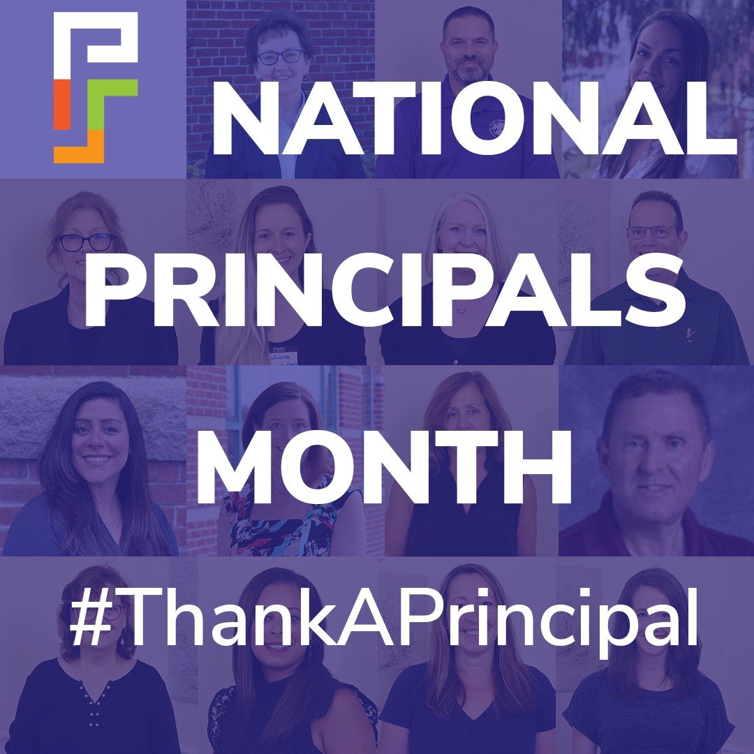
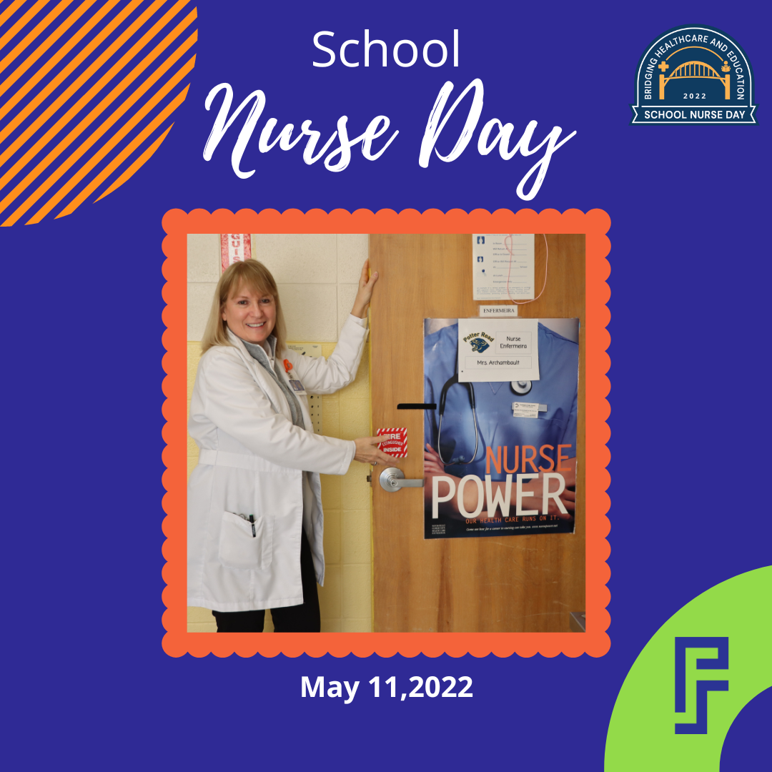
The photos below show a snapshot of physical branded material created since the launch of the logo and color palette in 2021.


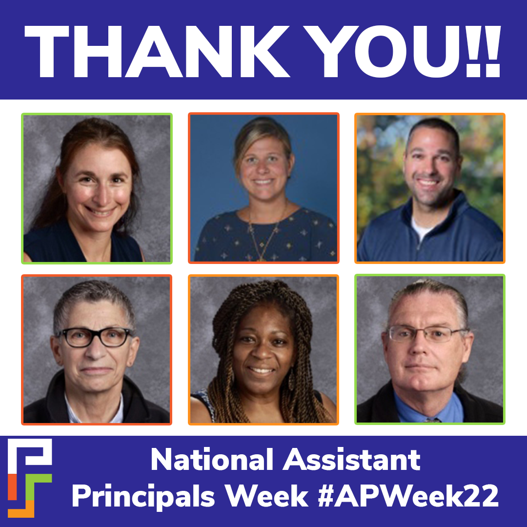
The photos below show a sample of assets created for digital use since the launch of the branding initiative.